
Color Is a Mood
The right color doesn't just change how a room looks. It changes how you feel the moment you walk in. That's not decorating. That's design.
Let me paint you a picture.
You've spent forty-five minutes in the paint aisle, holding seventeen swatches up to the light, and you still have absolutely no idea which one is right. You bring them home. You tape them to the wall. In the morning light they look fine. In the afternoon they look completely different. By evening, under your lamps, you're not sure you like any of them. You pick one — probably the safest one — and six months later you're still not sure you made the right call.
Sound familiar? You are not alone, and you are not bad at this. Color is genuinely hard. Not because choosing a color requires special talent, but because most people approach it backwards.
Here's the reframe that changes everything: color is not a decorating decision. It is an emotional one.
The question is never "what color do I like?" The question is always "how do I want this room to feel?" Answer that first, and the color follows.
Why Color Feels So Hard
Color intimidates people for a few reasons, and the biggest reason is that we think about it in isolation. We see the perfect paint color on Instagram and try to imagine that same color on our walls, in our specific room, with our specific furniture and our specific light. That is an almost impossible cognitive leap to make accurately. It's no wonder so many people end up with a color they felt neutral about and convinced themselves they'd grow to love it because it worked for someone else.
The second reason color feels hard is that there are simply too many options. Paint companies offer thousands of whites alone. Thousands. Most of them are beautiful. Most of them will look completely different on your walls than they do on the chip. The paradox of choice is real, and it is never more paralyzing than it is when you are looking at a paint deck filled with every color imaginable.
The third reason—and this one really matters the most—-is that we underestimate how much everything in a room affects how a color reads. The direction your windows face. The time of day. The undertones in your flooring and furniture. Whether your trim color is warm or cool. A color doesn't exist in a vacuum; it exists in conversation with everything around it. A soft sage green in a north-facing room can look flat. The same sage in a south-facing room glows. Same color. Completely different experience.
Start Here: Choose a Feeling, Not a Color
Before you look at a single swatch, sit in the room you're designing and ask yourself a few honest questions. When you walk in here, how do you want to feel? Calm and rested? Energized and focused? Warm and cozy—that gezellig quality where the room seems to exhale and pull you in? Sophisticated and grounded? Bright and airy?
These abstract questions offer real color answers, and when you know the feeling you're after, the field of options narrows dramatically, which is exactly what you want. Here's a loose cheat sheet to get you started:
FOR CALM + REST
Soft Blues, Hazy Greens, and Warm Whites
Think a bedroom that feels like exhaling. Muted, dusty blues and blue-greens — think aged denim, sea glass, the sky on an overcast morning — have a measurable calming effect. Warm whites with creamy or linen undertones (as opposed to stark, cool whites) keep a space feeling soft rather than clinical. Benjamin Moore's Tranquility, Farrow & Ball's Mizzle, or any warm white in the greige family will carry you there.
What to avoid: cool, bright whites with blue undertones, which can read sterile rather than serene. Anything too saturated in a bedroom tends to work against rest.
FOR WARMTH + CONNECTION
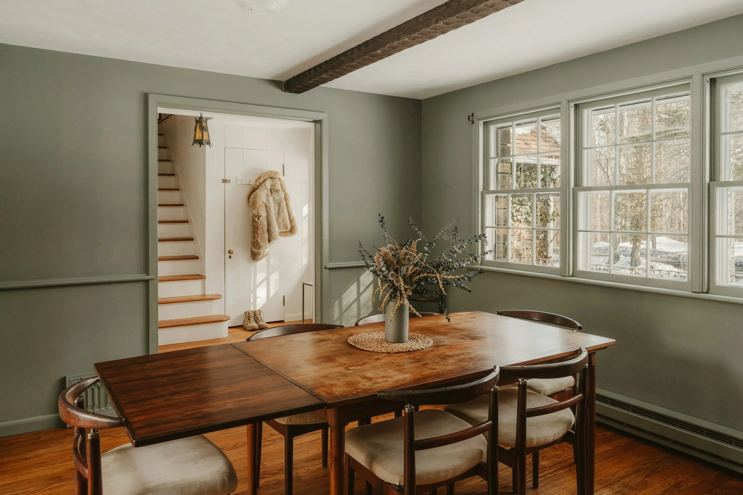
Terracottas, Warm Taupes, Soft Ochres, and Deep Greens
This is the gezellig palette. Colors that wrap around you. Terracotta and clay tones have been everywhere for the past few years because they genuinely deliver on the warmth they promise — especially in dining rooms and living spaces where connection is the whole point. Deep, earthy greens ground a room and make it feel rich without feeling heavy. Warm taupes and soft caramels do the quiet work of making a space feel lived-in and loved.
These colors tend to look extraordinary in rooms with warm-toned wood floors, leather, linen, and natural materials. They are less happy next to cold grays and cool metals — something to keep in mind if your existing pieces lean in that direction.
FOR ENERGY + FOCUS
Clear Whites, Soft Charcoals, and Purposeful Color
Home offices and workspaces are the rooms where people most often go too timid with color — and end up with a space that doesn't actually help them think. A crisp, slightly warm white keeps things bright without the harshness of a true bright white. If you want more personality, a soft charcoal or deep blue-green on a single wall (especially behind your desk) creates a sense of focus without making the room feel small. These are the rooms where a deliberate, confident color choice actually improves performance.
FOR SOPHISTICATION + DRAMA
Deep Navy, Forest Green, Plum, Inky Black
Dark colors are one of the most misunderstood tools in interior design. People avoid them because they worry about making a room feel small or dark — and in some cases, that's a valid concern. But in the right room, a deep, saturated color on all four walls (ceiling included, if you're feeling brave) creates something genuinely extraordinary: a room that feels like a destination. A library. A jewel box. A place people walk into and immediately want to stay.
The key is commitment. A deep color that's treated tentatively — one wall, or a shade pulled back to something safer — loses most of its magic. When you go dark, go all the way.
The Rules That Actually Matter
There are approximately ten thousand rules about color in interior design, and most of them can be safely ignored. Here are the ones that genuinely hold up:
Test in your actual light. Always. Buy a sample pot and paint a large swatch directly on the wall — not a piece of cardboard, not a sticky sample square. On the wall. Look at it in the morning, at noon, and under your evening lamps before you commit.
Mind the undertones. Every color has an undertone — a subtle warmth or coolness beneath the surface. Beige can pull pink, green, or yellow. Gray can pull blue or purple. White can pull almost anything. The undertone is what determines whether a color fights with your floors and furniture or sings with them. Train your eye to see it, or bring someone who already can.
The sixty-thirty-ten principle is your friend. Sixty percent of a room in a dominant color (usually walls and large upholstery), thirty percent in a secondary color (rugs, drapery, accent furniture), ten percent in an accent (pillows, art, accessories). It's a formula for a reason — it works.
Light changes everything. North-facing rooms receive cool, indirect light and tend to make cool colors feel flat and warm colors feel rich. South-facing rooms are bathed in warm light that makes almost everything look beautiful. East-facing rooms are glorious in the morning, cooler in the afternoon. West-facing rooms do the opposite. Know which direction your room faces before you fall in love with a color.
Don't forget the ceiling. The ceiling is the fifth wall, and most people leave it completely unaddressed. A ceiling in the same color as your walls (or a lighter tint of it) creates a cocooning effect that feels intentional and luxurious. A bright white ceiling in a room full of warm color can feel abrupt and disconnected. At minimum, consider it.
When You're Truly Stuck
Here's what I tell clients who feel genuinely paralyzed by color: start with what you already own. Look at your sofa, your rug, your curtains—the pieces you love most and are least likely to replace. Those pieces already contain a color story. Your job is to extend it, not invent something new from scratch. Pull out a secondary color from your favorite rug and paint the walls in a whisper of it. Echo the warmth of your wood floors in your upholstery. Let what you already have tell you where to go.
And if you've done all of this and you're still not sure? That's what designers are for. Color consultation is one of the most practical and immediately impactful services a designer offers—and it doesn't require a full renovation to make a significant difference in how your home feels.
Because in the end, that's the whole point. Not a color you could live with. A color that makes you feel exactly the way your home should make you feel.